


How interface reuse can help create familiar, positive experiences for users, speed up the design and development process and better enable reuse for others.
Hey, I’m Guy. I’ve been helping out on the team at CAST since the beginning of the year with design and interface work, primarily on our new Service Recipes platform.
A lot of our work at CAST centres around the idea of reuse — through Catalyst in particular we’re trying to help the charity sector become a stronger version of itself by helping enable organisations to share and pool knowledge and digital tools.
In this post, I want to share a bit about what this means in terms of our approach to designing our products.
Systems not silos
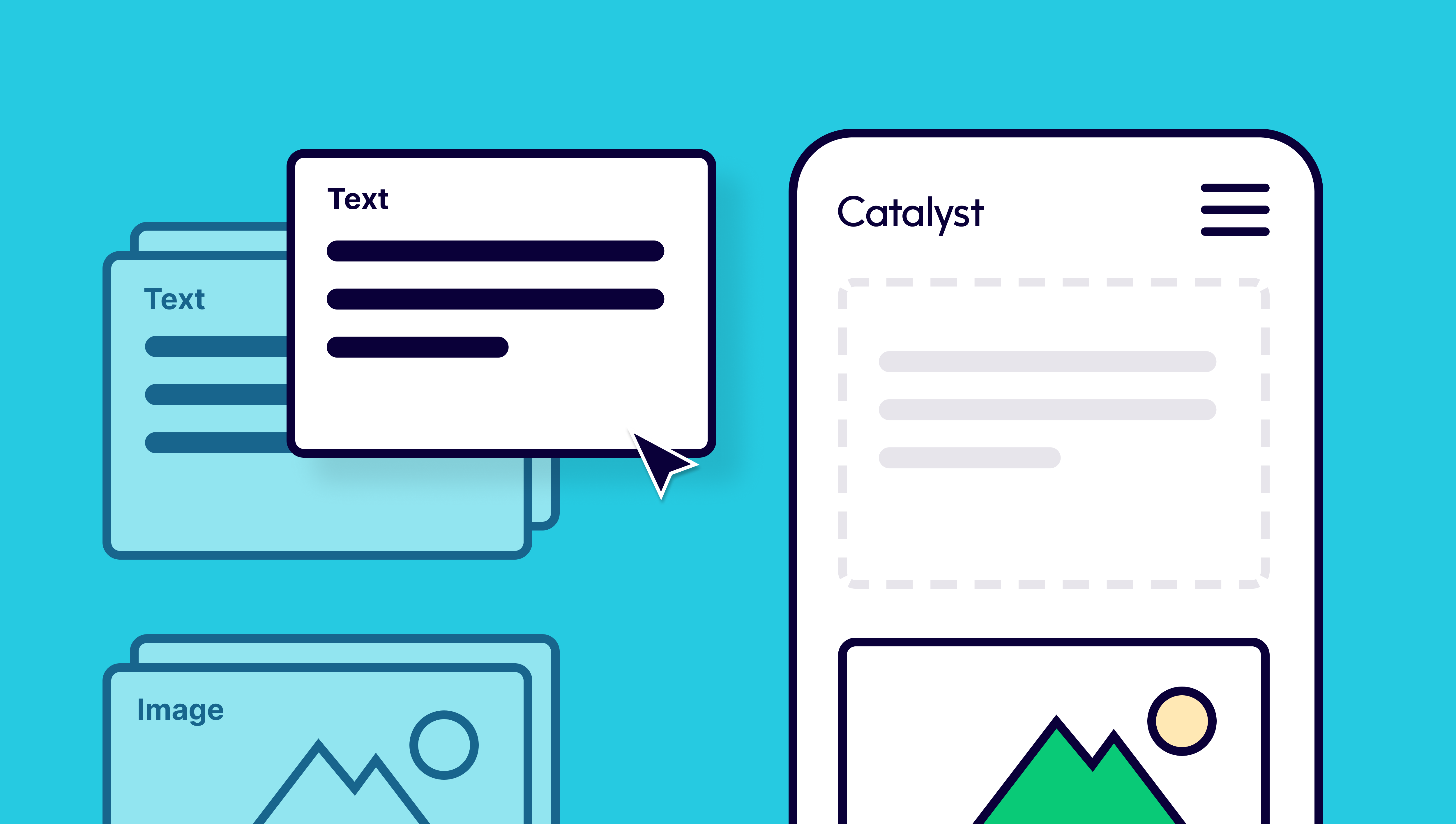
It makes a lot of sense to think in terms of reuse in our approach to product design. We don’t want to make interfaces ad hoc or use third party software to solve individual problems without consideration of the wider whole. Instead we’re approaching this in a much more systematic way to try to develop the beginnings of a ‘design system’ — a kit of parts that can be assembled and reused for Service Recipes and future products (including three that are currently in progress, some public facing, some for internal use).
The overall goal of interface reuse like this is to help create familiar, positive experiences for users, speed up the design and development process and better enable reuse for others.
These are very early days and this is very much work-in-progress – but we believe in making things open, as it makes things better. So what follows is a bit more of our thinking and progress so far.
The beginnings of our ‘design system’
The term design system is one that’s used widely in the world of interface and product design and one that can mean different things to different organisations. It’s also one which may change and evolve over time. I don’t want to go down that rabbit hole, but it is worth explaining what it means for us, at this early point in our evolution.
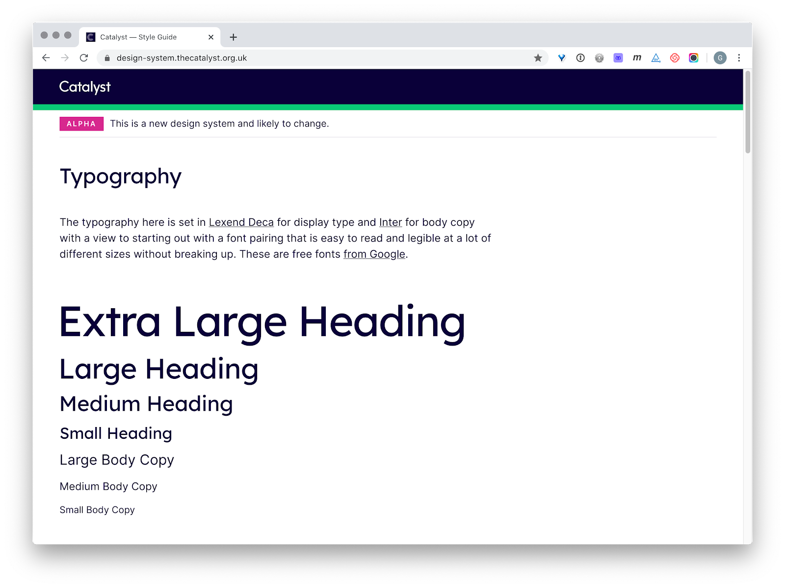
Our design system is essentially a set of presentational rules implemented in code (SCSS and the compiled CSS) and then displayed in a simple Heroku app.
It’s a very important point for us that it is actually implemented in front-end code as this is what ultimately enables it to be reused in other digital products.
The rules we’ve established in this simple system so far include:
Typography
- The fonts we use. (As a charity, we have opted to use free fonts to enable easier reuse and sharing without licensing concerns.)
- A hierarchy of type including headings and other copy. (In the spirit of reuse, our starting point for this hierarchy was to base it on the wonderful, tested and documented work from GOV.UK, a project I’ve also helped out on in the past and which is now used by local and central government websites around the world.)
- Default rules in code that control how that hierarchy of type behaves across different screen sizes.
- Basic formatting for things like paragraphs, lists, links and buttons.
Layout
- A grid system that works across different browsers and platforms
- Default rules in code that control how that grid system behaves across different screen sizes.
- Vertical and horizontal gutters/spacing rules and how these should behave across different screen sizes.
Colours
- Colours used for typography that we ensure pass WCAG AA for accessibility.
- Colours used for product/service phases — Alpha, Beta, Live and more.
- A simple set of brand colours. (Though the Catalyst brand is relatively new, at less than a year old – we believe in leading with useful, functional products that can then help shape our branding and look and feel as we better understand the shape of the problems we’re solving.)
Doing this work means we can import the CSS into a new app or product and it will be available from the get-go, giving a readily available responsive system for type, headings and layout.
These initial parts of the system are things we believe we should be able to some extent ‘set and forget’ at this early stage, not things we should have to repeat for each new service or platform. Or at least, they are things that give us a solid starting foundation that we will only revisit when we need to add to or modify them later to cater for new understanding and learnings from our users.
The future — growing and centralising our system
As you can see our system is quite rudimentary so far, but it is working well for us as it stands and is being used across two of our products — Service Recipes and the soon to be launched Pipeline. As time goes on and we learn more from our users, I anticipate evolving and iterating the system to include new components and modules as we need to solve new problems.
I expect we will also put some more work into our tooling and workflows to help automate and centralise much of this code more efficiently and make it even easier for us and others to reuse. We’ll give an update on this in the future as things become more meaningfully mature.
In the meantime, we hope you’ve found this post interesting. We think it’s really important to share our progress and be transparent in our approach — we should be open and accountable. This principle itself is an example of reuse having been inspired by the Government Digital Service's “make things open, it makes things better”.
Thanks for reading. If you have any thoughts or feedback, you can find me on Twitter — @futurefabric
Useful links from this post
https://design-system.thecatalyst.org.uk
https://recipes.thecatalyst.org.uk
https://github.com/WeTheCatalysts/static.thecatalyst.org.uk
Support & services
Our free services help you make the right decisions and find the right support to make digital happen.
Learn what other non-profits are doing
39+ organisations share 50+ Guides to how they use digital tools to run their services. Visit Shared Digital Guides.
